Most small business owners spend a lot of time worrying about the homepage. Does it look professional? Is the logo the right size? Are the photos good? All reasonable things to think about. But the page that actually determines whether a potential customer picks up the phone — or quietly closes the tab and rings someone else — is usually the contact page. And it's almost always the one that got the least attention.
This isn't a lesson in web design theory. It's about a handful of very specific, very fixable things that cause real enquiries to silently disappear. You never know they were there. You just notice that the phone doesn't ring as often as it should.
The person who visits your contact page has already decided they like you
Think about what it means when someone lands on your contact page. They've found your site, read enough to be interested, and actively gone looking for a way to get in touch. That's not a casual browser. That's someone who is, in most cases, ready to enquire. You've done the hard part. And yet this is exactly the moment where countless small business websites fumble it.
The contact page is not where you need to sell. It's where you need to not get in the way.
The problems that quietly turn people away
None of these are dramatic. There's no flashing error message, no broken link. The problems are subtler than that — and because of that, they're easy to miss:
- A contact form that doesn't work. Forms break more often than people realise — a plugin update, a server change, a spam filter tweak — and nobody tells you. The form looks fine on screen. It just doesn't send anything. Testing your own contact form every few weeks takes thirty seconds and is absolutely worth doing.
- No phone number. A significant chunk of people — especially anyone over about forty-five, and especially anyone wanting a local service — will not fill in a form if there's a number they can ring instead. If your number isn't visible on the contact page (ideally at the top, in large text), you've already lost some of them.
- An email address that's a clickable link — but only on desktop. On mobile, a phone number displayed as plain text can't be tapped to dial. An email address that's just text and not a mailto: link forces someone to copy and paste it into their mail app. Small friction. Real drop-off.
- No indication of what happens next. People are nervous about contacting strangers. If your form just says "Send Message" with no explanation of when you reply, what they should expect, or even a reassurance that you're a real local business, some people will hesitate. A single line — "We'll get back to you within one working day" — removes that hesitation.
- The page doesn't load properly on a phone. Over half of all web browsing happens on mobile. If your contact form requires a tiny tap on a cramped dropdown, or if the send button sits behind the keyboard, or if the page just looks broken on a small screen, people give up. They don't send an angry email about it. They just leave.
Why Google cares about your contact page too
Here's something that surprises people: Google actively looks for signs that a website belongs to a real, legitimate, locally-based business. A contact page with a full address, a local phone number, and — ideally — an embedded map gives Google useful signals that your business is genuine and geographically relevant. That matters for local search rankings.
If someone in your area searches for the service you offer and your contact page has no address, no local number, and nothing that anchors you to a real place, you're making Google's job harder. And Google tends not to reward sites that make its job harder.
This is also why your contact details need to be consistent. The name, address and phone number on your website should match exactly what's listed on Google Business Profile, on any directories, and on social media. Even minor differences — "Ltd" versus "Limited", a slightly different postcode format — can quietly undermine your local search visibility.
What a good contact page actually looks like
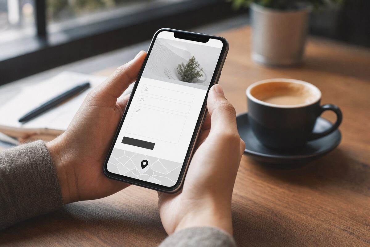
It doesn't have to be complicated. In fact, simpler is almost always better. Here's what a solid contact page for a small local business should include:
- Your phone number, large and near the top — and clickable on mobile
- A short contact form asking only what you actually need (name, email, brief message — nothing more)
- Your email address as a proper link
- Your physical address, even if you don't see clients there
- Your opening hours, so people know when to expect a response
- An embedded Google Map if location is relevant to what you do
- One line telling people what happens after they get in touch
That's it. No need for a wall of text about your values, no stock photo of someone shaking hands, no social media feed pulling in posts from three years ago. Just the information a ready-to-enquire person needs, presented clearly, on a page that works on any device.
A quick test you can do right now
Pick up your phone — not to ring anyone, just to use it as a browser. Go to your own website. Navigate to the contact page. Ask yourself: Can I tap the phone number to dial it? Can I fill in the form comfortably? Does the page load in under three seconds? Does anything look odd or cramped?
If the answer to any of those is no, you've found something worth fixing. And unlike many website problems, most of these are genuinely straightforward to sort out — they just need someone to actually look.
If you're not sure your site is working as hard as it should, or if you're thinking about getting a proper local business website built from scratch, it's worth talking to people who understand both the technical side and what local customers actually want to see. We build and host websites for local businesses starting from £299 at Advantec's web design service — and we're always happy to have an honest conversation about what might be holding a site back, with no obligation.
Sometimes the difference between a website that gets enquiries and one that doesn't isn't the homepage, the colour scheme, or even the SEO. Sometimes it's just the contact page — the one page you thought you'd finished.